Color-Drenched Bedroom Renovations: The 2026 Comfort Trend
Bedrooms are becoming more intentional, more expressive, and noticeably less afraid of color. This week's design coverage makes that shift hard to miss: Apartment Therapy featured a deeply personal color-drenched bedroom redo, its renovation coverage also highlighted renter-friendly drama, and Architectural Digest pointed to the power of interiors that feel genuinely personal rather than generically polished. Together, those signals describe a practical trend, not a passing social-media filter. In 2026, the bedroom is moving away from the idea that calm must mean blank. The emerging alternative is a cocooning room built with one coherent color family, useful furniture, and lighting that changes with the day.
Color drenching means carrying one hue, or closely related tones, across more than a single accent wall. Walls, trim, doors, ceilings, built-ins, textiles, and selected furniture work as a connected field. Done well, it makes an ordinary room feel edited and immersive. Done carelessly, it can feel dark, flat, or expensive to undo. The difference is planning: understand the light, give the eye texture, and make sure every large purchase earns its footprint. Here is how to translate the trend into a bedroom that feels personal and works every day.
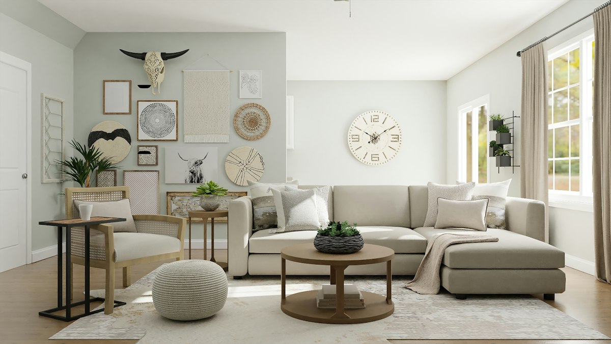
Why Color Drenching Is Landing Now
The appeal is emotional, but the logic is spatial. Bedrooms are asked to handle sleep, getting dressed, charging devices, reading, video calls, and decompression. A patchwork of unrelated finishes can make that load feel louder. A controlled color envelope reduces visual interruptions. It lets a modest room read as a whole instead of a collection of disconnected objects. That is especially useful in apartments, where a bedroom often has limited architectural interest and every visible surface carries more weight.
This is also a reaction to the all-purpose neutral room. Neutrals still have a place, but homeowners increasingly want rooms with memory and point of view. A mineral blue that recalls a favorite hotel, a muted rose that flatters evening light, an olive that connects to a garden view, or a tobacco tone that makes a north-facing room feel grounded can all be calmer than a timid mix of beige, gray, and white. Personal does not have to mean loud. It means selecting a direction and repeating it with restraint.
Recent renovation stories support the practical side of the trend. A color-drenched redo can concentrate impact on paint, fabric, and lighting instead of requiring a complete architectural overhaul. It is a useful approach for a homeowner refreshing one room and for a renter working with reversible elements. The key is to treat the color as a system: undertone, sheen, contrast, and material all matter more than the paint chip alone.
Build a Color Family, Not a Single Flat Shade
The strongest rooms are rarely painted in one identical color from floor to ceiling. Start with a dominant hue, then build a family around it. If the anchor is warm terracotta, the family might include clay, cinnamon, dusty peach, oxblood, and softened cream. If the anchor is blue-green, it might include deep teal, faded eucalyptus, smoky blue, and oat. This layered approach gives the room depth while preserving the enveloping effect.
Use large surfaces to establish the anchor, then vary value and texture rather than adding random contrast. For example, paint walls and trim in related matte finishes, choose a slightly deeper curtain, add a quilt with visible weave, and introduce wood or rattan to interrupt the continuous color with natural grain. A room needs those small changes in reflectivity. They catch daylight differently and keep the scheme from looking like a stage set.
Test samples in the actual room for at least a full day. Morning light, late-afternoon light, and bedside lamps can pull the same paint toward very different colors. North-facing rooms commonly need a warmer or more saturated version of the intended shade; sunny rooms can tolerate a dustier one. Paint boards are better than tiny swatches because they reveal how a color behaves near flooring, linens, and existing furniture. Before committing, hold up the bedding, curtain fabric, and a wood sample beside the board. This ten-minute check can prevent a near miss.
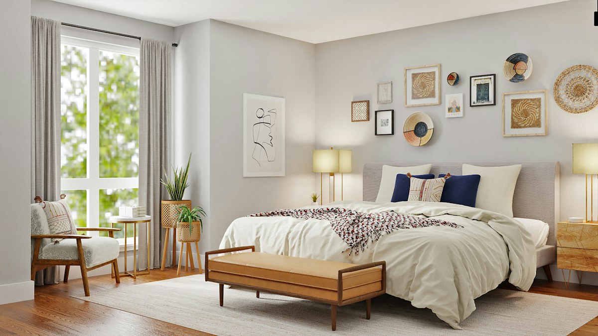
Use Lighting to Make the Color Livable
Color drenching does not work on paint alone. Lighting decides whether the room feels intimate or cave-like. Start with layers. Ambient light fills the room; task light supports reading, dressing, and finding things; accent light gives the scheme a soft evening presence. A single bright ceiling fixture makes most bedrooms feel unfinished, especially once the walls are saturated.
Place reading lights where they are genuinely useful, not merely symmetrical. Add a shaded lamp or indirect LED source at the bedside. Consider a vanity light for grooming and a dimmable source near the wardrobe. Warm bulbs usually support earthy, red-based, and wood-rich palettes; neutral white can be useful around mirrors when accurate color is important. The best solution is not a universal bulb temperature but separate controls, so the room can be bright enough to function in the morning and quiet enough to wind down at night.
Reflective surfaces deserve attention. A glass tabletop, mirror, metal handle, or gloss-painted trim can distribute light through a deep scheme. Use them sparingly. In a small room, one well-positioned mirror can expand the perceived depth; a row of shiny accessories often just becomes clutter. Think of reflection as a light-management tool, not a decorative default.
Balance the Envelope with Texture and Useful Storage
A saturated room needs texture more than extra decoration. Start underfoot and work upward: a low-pile rug, a linen or cotton duvet, a knit throw, woven shade, upholstered headboard, and wood-grain cabinet each change the way the same color is perceived. Texture adds warmth without asking the eye to process another pattern. It also makes the room feel finished in photos and in daily life.
Storage is equally important. Color drenching amplifies what is left out because the room's surfaces are so intentional. A charging cable, a pile of skincare, or an overflowing chair can break the spell faster than an imperfect paint edge. Choose furniture that gives small objects a home: drawers at the bedside, dedicated compartments at a vanity, and clearance under or around the bed for baskets only if they can be kept disciplined. Closed storage is often the better partner for a strong palette because it protects the visual calm you just created.
Keep pattern on a short leash. One patterned textile or artwork can add character, but it should borrow colors from the established family. A floral pillow with the same clay, cream, and wine tones as the walls will read as intentional; an unrelated black-and-white graphic will feel pasted on. This rule is useful when shopping too. If an item cannot name its relationship to the room's palette, it is probably an impulse rather than a solution.
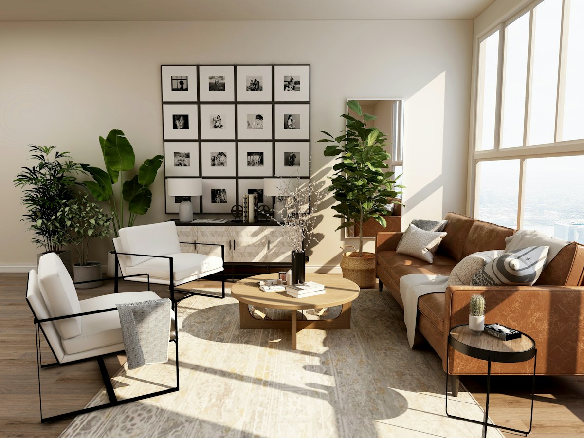
Renovate in the Right Order
Color drenching can be affordable when the order of decisions is correct. First, define how the bedroom has to work. List the non-negotiables: sleep, device charging, makeup or dressing, reading, laundry, luggage, or a work surface. Second, measure the room and draw a simple plan. Third, select the main furniture pieces. Only then choose paint and textiles. Paint is flexible; a poorly sized bed or a vanity that blocks circulation is not.
Leave at least a comfortable walking path around the bed, and open drawers on the plan before buying them. Pay attention to outlet locations and door swings. If you cannot move electrical work, choose furniture with built-in charging where it helps, rather than creating a tangle of extension cords. For renter-friendly changes, try removable wallpaper inside a nook, long curtains that cover an awkward window proportion, plug-in sconces, and a large textile headboard. These changes produce the layered look without pretending the room needs a full gut renovation.
Finally, edit the accessories. A color-drenched room is not a mandate to match every object. It is a framework for making fewer, better choices. Leave one shelf partially empty. Put daily clutter behind a door. Choose art that feels specific. The room should feel like an exhale, not like a color coordination exercise.
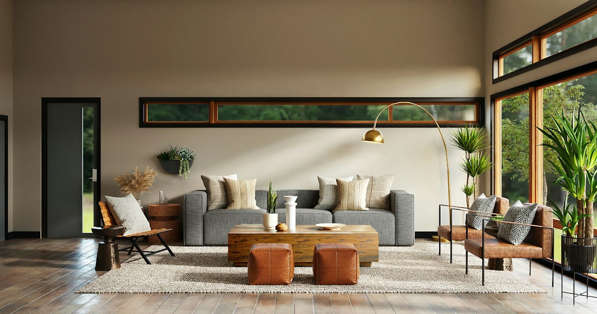
Practical Takeaways
- Start with one feeling: restful, grounded, playful, or dramatic. Choose the color family after you can name the desired mood.
- Sample at room scale: compare painted boards against flooring, bedding, and daylight before buying gallons.
- Use three lighting layers: ambient, task, and low evening light make a saturated color usable at every hour.
- Bring in texture before pattern: wood, rattan, linen, and quilted fabric give depth without visual noise.
- Protect the calm with closed storage: drawers and cabinets matter as much as the paint color.
- Buy the anchors first: plan the bed, bedside storage, and dressing zone before selecting decorative accessories.
Featured Products
These active-store picks support the color-drenched bedroom approach by solving the functional zones that most often create clutter: getting ready, bedside organization, and evening lighting.

10-Drawer LED Mirror Vanity Desk
A lit vanity creates a purposeful getting-ready zone while its ten drawers keep cosmetics, cords, and daily essentials from becoming visual noise. Its white finish is especially easy to fold into a color-drenched scheme: it can brighten a deep wall color or support a soft pastel room without competing with the paint.

Rattan Nightstand with Charging Station, 3 Drawers, Caramel Oak
A rattan nightstand adds the tactile counterpoint that a painted room needs. Use its drawers for the small items that otherwise land on the floor or bed, and use the integrated charging station to keep a calm bedroom from becoming a cable display.

Twin LED Bed Frame with LED, USB Charging, No Box Spring Needed
A bed frame with built-in LED lighting and USB charging solves two everyday needs at the room's anchor. Choose a bedding palette that bridges the frame and wall color, then let the headboard lighting act as a low-level evening layer rather than the room's only light source.
Conclusion: Make the Bedroom Feel Like Yours
The color-drenched bedroom trend is worth following because it offers more than a photogenic wall. It is a way to make a high-use room feel coherent, restorative, and unmistakably personal. Choose a color family that suits the light, layer it with practical lighting and tactile materials, and give everyday objects a place to disappear. Then let a few well-chosen furniture pieces support the rituals that happen there every day. Explore Vektaya's bedroom furniture collection to build a room that holds both your style and your routine.
0 comments